“To be nobody but yourself in a world that’s doing its best to make you somebody else, is to fight the hardest battle you are ever going to fight. Never stop fighting. ”
One of the hardest, yet most important, things about starting your own business is creating a brand that not only speaks to what you peddle, but who you are. When you're in a creative business, your brand should not only represent you, but stand out and creatively speak for you. Everything creative you do represents who you are. Your work, instagram, pinterest, your blog, facebook, twitter...the list could continue on forever.
When I started working on my brand years ago, I spent countless hours mocking up designs, questioning my personality + reasons for creating, and had way too many late night talks with myself about how I wanted to appear to the world and what I was really trying to achieve. Through the last three years, I've been through too many "re-brandings." Not a single one of them fit the feel of my work and how I wanted to be perceived as a creative. It needed to feel natural + self-actualizing, but everything before this felt like a lie.
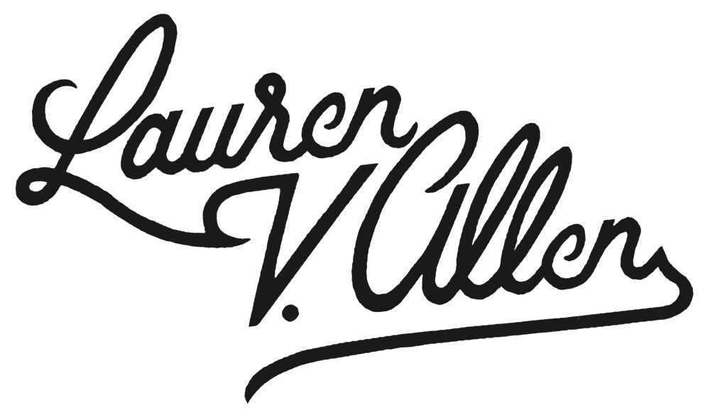
When I finally decided I was going to freelance full time, I knew I had to take the plunge and hire someone who could take my mumbo-jumbo mishmash of thoughts and turn it into something encapsulating + authentic. After doing many brain dumps + admitting to myself who I was and how my work represented that, I knew just the direction to take my brand. It had to be clean, monochromatic, modern but with a vintage twist and also touch on my own Air Force Brat/Mexican-American heritage. Because after all, a brand isn't just a logo, it's who you are.
I got in touch with the über-talented artist, Joshua Noom, who I had been avidly following on Instagram. He somehow took my ramblings of nothing, looked through my portfolio, and put together the most perfect visual representation for me. Joshua has this vintage tattoo feel to his hand-created illustrations + lettering that spoke to me unlike anything else. As a lover of high-quality hand lettering + all things typography, I knew he was the person I wanted to help bring my thoughts into fruition.
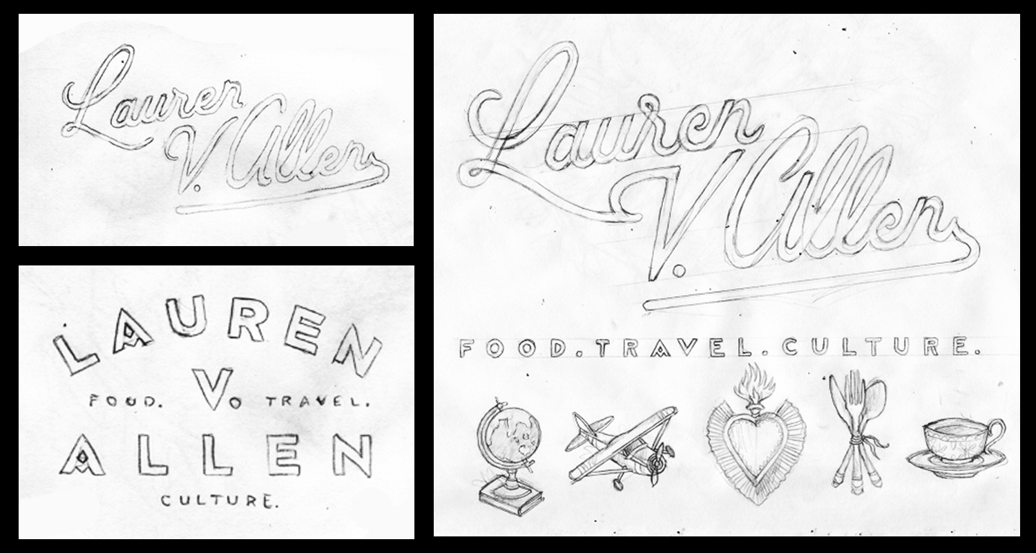
Joshua worked super quick and within a couple days, I had my first sketches. I literally jumped for joy around my office because he was visualizing my (note: very random and unorganized) thoughts, which had been a lifelong battle for me. We both decided on the script for my name, and because I love the A in the block letters, decided to incorporate that into the "food. travel. culture." part of my logo.
And finally, after deciding that a bunch of tiny illustrations could be used throughout my site + branding materials, we came up with some that encompassed my work with food, travel, + culture in addition to how I saw my brand + myself. (And y'all, that sacred heart is the best thing I've ever seen. I literally want to put it on everything in my life.) When the final sketches popped up in my inbox before the official "inking," I was chilling at my favorite teahouse, and I let out a squeal of excitement and impromptu dance, interrupting everyone's zen afternoon. If they only knew the hand-created treasure that was in my gmail, they'd have joined me in a hot second.
Joshua, you were a dream to work with! Thank you for all your help, despite my lack of guidance. I only hope we can work together (and maybe even collaborate!) in the future!
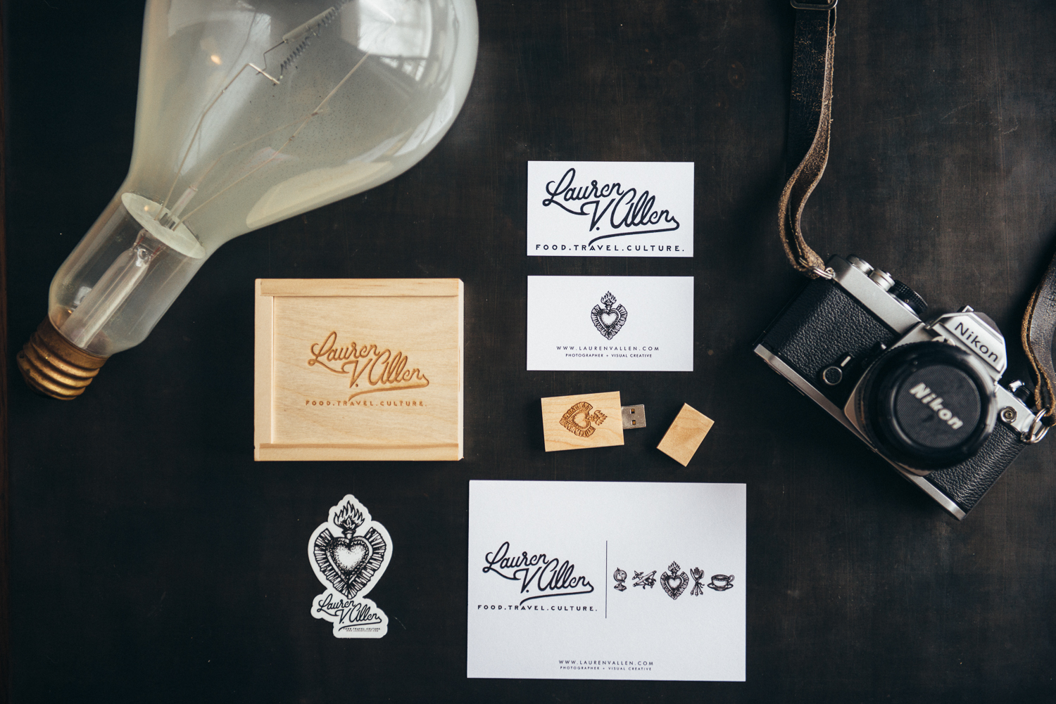
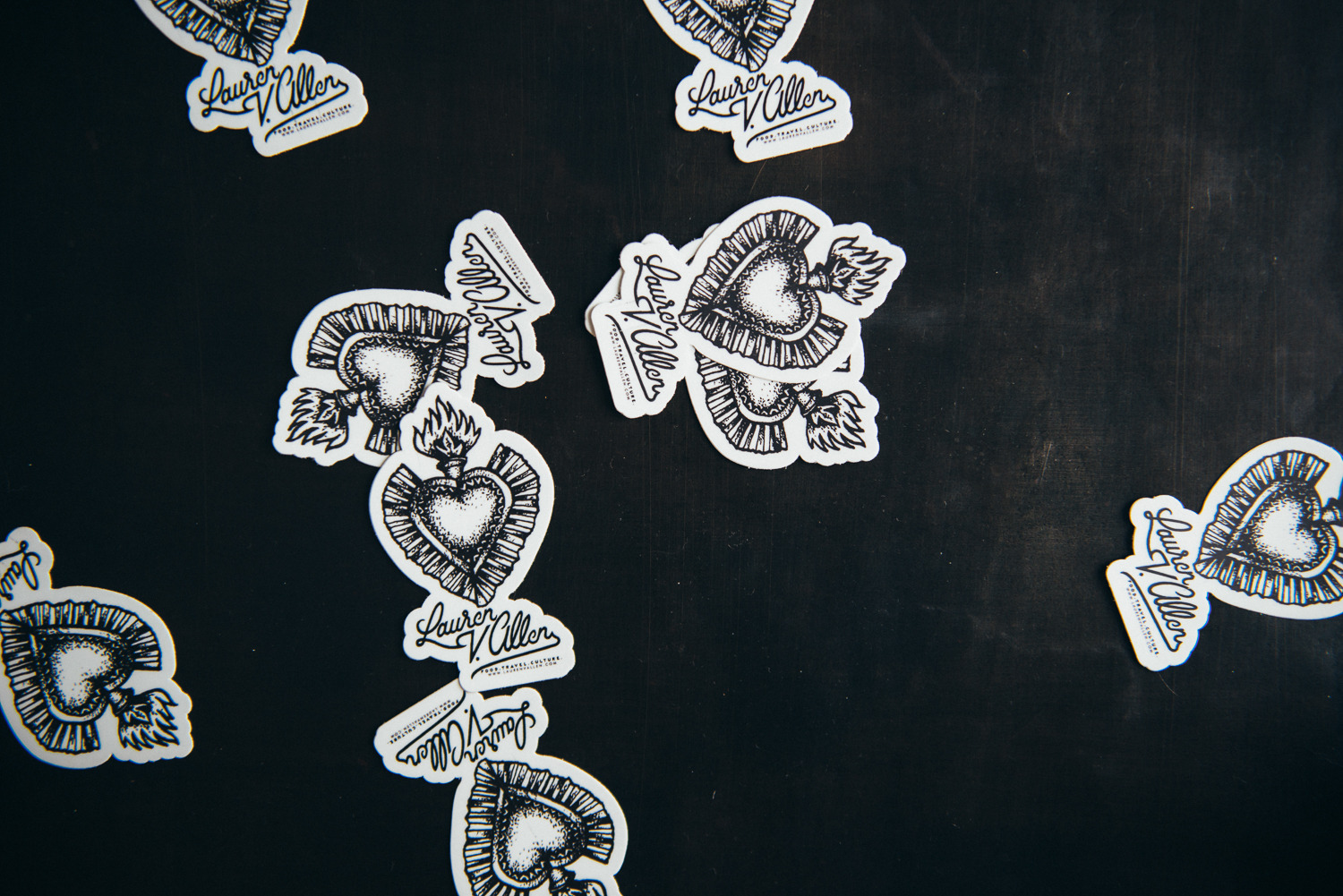
Once the visual side of my brand was complete, I was ready to start ordering promotional and client materials. I chose to stick with clean + monochromatic materials because I have such colorful work. I didn't want things to clash, so the monochromatic + minimalistic look was just what I needed. In addition, I wanted a natural, yet creative client-delivery system that also represented the quality of my work. I went with engraved wooden boxes + thumb drives because they still fit into my brand and are quite a show stopper. And lastly, I ordered stickers...because why the hell not?! Who doesn't love a sticker?
Logos + Handlettering: Joshua Noom
Business cards, promotional cards, + stationery: Moo.com
Engraved wooden box + thumb drive: Photoflashdrive.com
Stickers: Sticker Mule
